The Geometry of the Spirit

Written by David James
Photographs courtesy of Musée D'Art Et D'Histoire
Additional photographs courtesy of Zamana Gallery
Islamic calligraphy is without doubt the most original contribution of Islam to the visual arts, yet it is only recently that it has come to be appreciated in the West. Even among lovers of Islamic art, calligraphy has been the interest of a minority rather than the majority. But in past years exhibitions of Islamic art have included more and more examples of calligraphy, and there have been successful exhibitions devoted entirely to calligraphy, such as that at Asia House, New York, in 1979 and the exhibition of the Musée d'Art in Geneva, which toured Europe in 1988 and 1989 and is now on display in Amman.
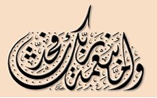
For Muslim calligraphers, the act of writing - particularly the act of writing the Qur'an or any portion of it - was primarily a religious experience rather than an esthetic one. Most Westerners, on the other hand, can appreciate only the line, form, flow and shape of the words that appear before them. Nevertheless, many recognize that what they see is more than a display of skill with a reed dipped in ink: Calligraphy is the geometry of the spirit.
In the West calligraphy has always been a minor art. In Islam its importance is paramount, absorbing the creative genius that, in the West, went into religious and secular painting, sculpture and music. The sacred nature of the Qur'an as the literal word of God, not a human document, gave the initial impetus to the great creative outburst of calligraphy which began in the seventh century and has maintained its momentum until now.
Calligraphy is found in all sizes, from colossal to minute, and in all media. But the most important examples are those produced on paper with a simple reed pen, called qalam in Arabic. Seated on the ground, with his paper supported by his knee, the calligrapher wrote in firm, sure strokes which indicated his total physical and mental control over the pen. It took years of training and practice, but the resultant masterpieces of outstanding calligraphy excited the admiration of high and low, were collected, preserved, and treasured, and were often bought and sold for the equivalent of the "old master" prices of our own day.
The history of Islamic calligraphy begins in the seventh century with the writing down of the Qur'an in a script derived from that of the Nabateans, a Hellenized, Arabic-speaking people from west of the River Jordan, the builders of Petra in Jordan and Madain Salih in Saudi Arabia. The Nabateans were producing rock inscriptions, in an alphabet recognizable as the one which would later be used to copy out the first Qur'anic texts, as early as the fourth century.
We know considerably more about the scripts of early Qur'ans since the discovery a few years ago of a huge cache of Qur'anic pages and fragments in the Great Mosque of Sanaa, in Yemen. The manuscripts had become too tattered for further use, but, by tradition, the sacred character of Qur'anic texts prevents their destruction. These fragments were therefore stored above the ceiling of the mosque, and are now being studied by the German scholars Gerd Puin and Hans-Caspar von Bothmer, both of whom have been deeply involved in the project to assist Yemen conserve this remarkable find.
There is another similar collection of old Qur'anic fragments in Istanbul at the Turkish and Islamic Museum. It consists of material brought there by the Ottoman authorities from the Great Mosque of Damascus at the end of the 19th century, after fire had destroyed part of the building. This mass of fragments is in better condition than those of Sanaa, though not quite as old, and they have been worked on intermittently for the past 30 years. Recently a major study has been undertaken by the French scholar François Deroche, who is examining and cataloguing the material.
The early scripts in which Qur'ans were written were bold, simple and sometimes rough. Initially, they lacked the short-vowel indicators - so that a reader had to rely on context to know which vowel to insert in a given syllable - and were also without the system of dots, placed above or below certain characters, that distinguish s from sh, for example, or t from b, and so on. Again, only context could guide the reader in distinguishing certain similar letters from each other. The scripts used, from the seventh to the 11th century, were ultimately derived from those of the Hijaz, that is of Makkah and Medina. They can be broadly grouped into three main families: Hijazi, Kufic, and Persian Kufic.
Hijazi, the prototypical Qur'anic script, initially appeared in vertically-formatted pages, and is a large, thin variety with ungainly vertical strokes, often sloping to the right. Kufic is usually written only in horizontal page formats, and is a totally stable form of script in which the base-line is the key element, with upward and downward strokes springing from it. Of all the early scripts, Kufic is the most majestic, and no faith was ever diffused by a finer one. Its majesty and stability reflect the classical period of Islam in which it was produced, when Islamic civilization had an unshakeable confidence in its superiority. Unlike regional Hijazi and Persian Kufic, "true" Kufic was used from Islamic Spain all the way to Iran, a universal script reflecting a universal civilization.
Persian Kufic appeared in the 10th century and endured until the twelfth. In Persian Kufic, the decorative possibilities of the script were stretched to their limits, with the important proviso that legibility had always to be retained. The system of vocalizing the script - marking the short vowels - and employing distinguishing dots, or points, were essentially those of modern Arabic. Thus Persian Kufic employed the system used in contemporary cursive scripts like naskh, which we know was already being used to copy Qur'ans by the ninth century, though the earliest extant example is still the 1001 Ibn al-Bawwab copy of the Qur'an in the Chester Beatty Collection.
Western students of Islamic calligraphy have used the term "cursive" to distinguish scripts like naskh, thulth, muhaqqaq, and rayhan, which are cursive in appearance, from the Kufic family whose members are angular. However, medieval Muslim writers on calligraphy and the development of writing understood matters differently. According to their way of thinking, scripts other than Kufic could be classified into two broad categories: murattab, meaning curvilinear, and yabis, or rectilinear. The rectilinear category embraced muhaqqaq, naskh and rayhan while thulth, tawqi', and riq'a were considered curvilinear. This division was also the division between Qur'anic and non-Qur'anic scripts: Rectilinear scripts were - usually - employed for the sacred text, curvilinear ones for chancery and civil-service documents and correspondence.
To distinguish the different "hands", or styles of script, can be notoriously difficult. Rayhan, for example, is not simply a smaller version of muhaqqaq, the main Qur'anic script, but its final alif and lam letters also often appear to taper to a point, there is usually a more pronounced spike on the initial alif-lam of the definite article, and its vowels are finely written. Tawqi' and riq'a, hands developed for official correspondence and documents, are also difficult. Tawqi' looks like naskh but has many additional ligatures - linked characters - that cause letters like ra' and waw, which are normally joined only to the preceding letter, to link up with the letters on both sides of them. But riq'a is only a smaller form of tawqi'.
As well as the six main hands of classical calligraphy, there were a number of important regional varieties. Islamic Spain and North Africa used forms closer to Kufic in appearance than any of the Eastern post-Kufic hands. Those forms, Maghribi and Andalusi, were confined to the western part of the Islamic world and, although the art of calligraphy had exactly the same prestige there as it had in the East, their calligraphers were unknown outside Spain and North Africa.
Iran and Ottoman Turkey, however, produced local varieties of scripts which gained acceptance far beyond their places of origin. Among these, perhaps the most important was nasta'liq, which was developed in 15th-century Iran and perfected there in the 16th century. Unlike all earlier hands, nasta'liq was devised to write Persian: Although the Iranians had adopted the Arabic alphabet together with the Islamic faith in the seventh and eighth centuries, and although it was expanded by the adoption of huge numbers of Arabic words, Persian maintained its existence as a distinct language.
In nasta'liq the horizontal element of the Arabic script is emphasized, even exaggerated. The result is a particularly pleasing form which seems to hang or float across the page. This quality is increased when writing poetry by arranging the script diagonally across the page, enclosing each line of verse in a cloud cartouche. Nasta’liq was used to write Persian verse wherever Persian was a literary language – thus not only within Iran but also at the Moghul court and the courts of the kingdoms of the Deccan. Under the name of ta'liq, it was also used by Ottoman calligraphers in Istanbul, where Persian was widely understood among the educated, to write poetry in Ottoman Turkish.
Another local Iranian form, derived from nasta'liq, was shikastah, in which the script becomes incredibly complex, convoluted, and largely illegible to the inexperienced eye. Its use was largely confined to 19th-century Iran during the Qajar dynasty, and perhaps reflected the political and social convolutions of the time.
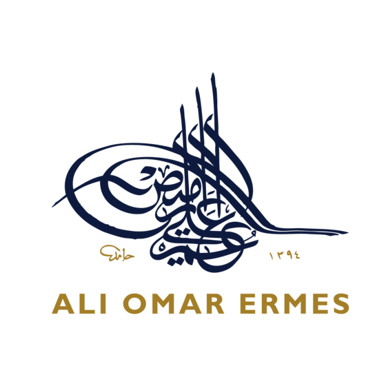
The Ottomans devised at least one local style which became more widely used. This was diwani, in which official chancery documents and firmans, or decrees, copied. Like shikastah, it is an extremely complex style, well suited to express a complex and largely artificial language like Ottoman Turkish, a hybrid of Turkish Arabic and Persian. Nevertheless, despite the shortcomings of the official language, few civil-service communications have ever been more superbly presented, Such documents always began with the most imposing invention of the Ottoman chancery, the imperial tuğra or cipher. This consisted of the name and patronymic of the sultan, together with an adulatory or descriptive phrase such as muzaffar da’iman - "ever victorious" - and a number of additional decorative strokes. These tuğras were often beautifully decorated by court artists and many are superb works of art in their own right. One such, a tuğra of Sultan Süleyman I, was part of the recent exhibition "The Age of Sultan Süleyman the Magnificent" (See Aramco World, August 1987).
Below the tuğra, the text of the document was copied out in diwani, an elaborate form of ta'liq, with each line rising up toward the left and enclosed in a veil of decorative detail seeming almost deliberately to obscure the text. Diwani was adopted in the 20th century by most of the states set up in the old Arab provinces of the former Ottoman Empire as their ceremonial script, and it is frequently employed on official documents and commemorative public inscriptions. But it is often combined with Kufic, as if to proclaim the Arab calligraphic heritage: Kufic was, after all, an Arab invention.
As well as mastery of all the different forms of script an equally important matter for the calligrapher was the question of design and composition. Once the Qur'an began to be copied out formally, these matters took on a theological character, as well as an esthetic one. Should all copies be written in exactly the same way? Should they all have same number of lines? Could words be broken at the end of a line and continue onto the following one? On these points there appears to have been no general consensus at first. Eventually, however, Qur'ans came to be copied out in odd numbers of lines and the splitting up of words was forbidden.
This practice in turn presented problems for the calligrapher, since each line now had to be carefully planned to finish with the final letter of a word. Each line also had to be esthetically pleasing - though calligraphers may not quite have thought of it in those terms - and the relationship of the lines, one to another, had to be carefully thought out. This was particularly so in the case of large-format Qur'ans, whose pages might reach more than 150 centimeters (5 ft.) in height but had only a small number of lines on each page.
The calligrapher also had to consider each page and the one opposite it as a whole, because each had to balance the other. In early times there is evidence of much complex experiment in these matters, and the solutions arrived at had to be significantly altered twice, when the format of copies of the Qur'an was changed: first from a vertical format, like that of a modern book, to the distinctive horizontal format of Kufic Qur'ans, then back again to the vertical one several centuries later.
Iranian and Ottoman calligrapher-undertook even more complex experiments. As early as the 12th century there is evidence of Qur'ans being written using different sizes and types of script. In Safavid times these experiments reached their climax, with pages divided into five compartments. Muhaqqaq was used in the first and fifth compartments, thulth in the third, and a smaller naksh script in the second and fourth compartments. The production of poetic works, like Qasidat al-Burdah, "The Poem of the Mantle," gave even greater scope to the talents of calligraphers in design and composition.
We do not know when the idea of calligraphic compositions based on a word, a phrase, or even a letter first arose. Preserved in albums in Topkapı Palace in Istanbul there are some fine examples by 15th-century Turkoman calligraphers; these were brought there from Tabriz after its capture by the Ottoman armies in 1514. But undoubtedly such compositions go back much earlier. The first separate calligraphic composition was perhaps the phrase Bismillah al-rahinan al-rahim - "In the Name of God, the Compassionate, the Merciful" - with which every chapter of the Qur'an begins. Due to the imbalance of the letters this is an awkward phrase to write well and is always a test of the calligrapher's skill.
The separate calligraphic composition reached its ultimate development in the 18th and 19th centuries at the hands of Iranian and especially Ottoman calligraphers like Mustafa Rakim, who died in 1826. Outstanding experiments had already been made in this area by Ahmet Karahisan - one of the most original Ottoman calligraphers - in the 16th century, but his ideas were before their time, and were not taken up by others until some 300 years later.
One area where composition was of immense importance was in the application of calligraphy to functional objects. Perhaps the finest examples of this occur on 10th-century ceramics from the Samarkand area. Simple inscriptions in classic Kufic, always in Arabic, were applied to the rims of plates and dishes, usually pure white in color. The results are quite splendid and certainly, to Western eyes at least, represent some of the most esthetically pleasing and exciting examples of applied Islamic calligraphy.
But perhaps the most important application of calligraphy to functional objects, and one of the earliest, is to be found in architecture. We read of an Umayyad calligrapher who wrote in gold on the wall of the Prophet's Mosque in Medina, but there are references throughout Islamic history to famous calligraphers producing inscriptions for buildings: It was a task which they were frequently asked, or instructed, to undertake. Usually these inscriptions were first written on paper and then transferred to ceramic tiles for firing and glazing, or were copied onto stone and carved by masons. In Turkey and Persia they were often signed by the master who produced them, like the monumental inscription for the Mosque of Gawhar Shad in Meshhed, written in 1418 by the bibliophile prince Baysunqur, grandson of Timur (Tamerlane).
In other places, such as Mamluk Egypt, we rarely know the names of the masters who produced monumental inscriptions, though there are countless examples in stone and stucco. Only the fine Kufic inscription in the mosque-madrasa of Sultan Hasan in Cairo, built in 1356, is signed, but some other inscriptions can nonetheless be fairly safely attributed. The imposing line of thulth running around the outside wall of the monastery built in Cairo in 1309 by Baybars al-Jashnagir, later Baybars II, was almost certainly the work of Muhammad ibn al-Wahid, a well-known Cairo master. He was a personal friend of Baybars and at the latter's request copied out a magnificent seven-volume Qur'an which is today in the British Library.
We are fortunate in having considerable information on Muhammad ibn al-Wahid, since the lives of most Mamluk calligraphers were not recorded by Arab historians. However, certain historians who wrote in Persian and Turkish furnish us with substantial accounts of all the leading Iranian and Ottoman masters, as well as giving basic information on a host of minor ones. There are also manuscripts and albums in existence by these figures, as well as signed monumental inscriptions. Manuscripts and album pages often give details of a calligrapher's master, or the patron for whom he worked, helping us build up a picture of his life and work.
Several masters themselves composed verse or prose works on the art of calligraphy. Muhammad ibn al-Wahid, for example, composed a treatise on calligraphy and also wrote a commentary on a poem by Ibn al-Bawwab, one of the most famous calligraphers of all time, who died in Baghdad in 1022. Ibn al-Bawwab's poem was supposed to elucidate the art of the pen and encourage his disciples, but its effect must have been rather the opposite, as he quite pointedly wrote that he had no intention of divulging the true knack of his art. But he did give much interesting information on the quality of the reeds which were used for writing, how to select the best reed and how to test it. He described how to trim the point, though he hesitated to give too much information on this crucial matter. He told how to position oneself when writing, what type of paper to use, how to prepare it and how to make the ink - a process that, for the best type, takes weeks.
Muhammad ibn al-Wahids commentary supplemented all this from his own experience and tried to fill in the gaps by Ibn al-Bawwab. But most calligraphic knowledge was passed on from master to pupil: No one could become a great calligrapher by reading a book or a poem about it any more than one can become a great musician today by reading scores. And although the principles of the calligraphic art can be taught - then as now - can be described in a scientific manner and carefully explained, still, in the final analysis, calligraphy is an art, and as such is often as much about breaking the rules as about following them. We must remember, when looking at calligraphy, lithe great masters were born to it.
Once a young man's potential as a calligrapher was recognized, he would be set to work under the eyes of a master, to perfect all the basic hands; he would also learn the secrets of ink-making and perhaps other arts like paper-making and illuminating. But most of his time would be it copying and practicing until he was considered good enough to work on his own; he would then receive an ijazah, or license, to this effect. He could also decide to work for a time under another master particularly known for his skill in one or other of the six main hands. He would then be employed as a scribe, working on his own or in government service. Although the work of the scribe - and thus the scribal profession - disappeared in Europe soon after the arrival of printing at end of the 15th century, printing did not become firmly established in the Middle East until the 19th century, and the profession continued for centuries in Islamic world.
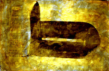
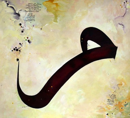
The art of the calligrapher continues even today. Despite the abolition of the Arabic Alphabet by Ataturk in 1928, Turkey has produced some of the finest calligraphers of the 20th century, and there are important exponents of the art in most Arabic-speaking countries, as well as in Iran and Pakistan. There are also outstanding calligraphers living in London, Paris and other Western cities, the exhibition of whose work has helped to bring to the attention of the Western public the supreme art of Islamic calligraphy.
David James on leave from his position US Islamic Curator at Dublin’s Chester Beatty Library and Gallery of Oriental Art, is currently curator of the Nour Collation of Islamic Arts in London.
This article appeared on pages 16-27 of the September/October 1989 print edition of Saudi Aramco World.
Leave a comment
Also in ART & CULTURE

2e Édition De Fikra “la Créativité Est Le Pilier De L’entrepreneuriat”
Vincenzo Nesci, l’un des principaux promoteurs de la 2e édition Fikra, lors de cette conférence internationale a abordé «la création d’entreprise et l’entrepreneuriat». Selon le directeur exécutif de Djezzy, ces derniers, «doivent être réalisés dans des conditions d’optimisme et de créativité pour permettre un réel essor dans les domaines commercial, industriel et créatif»


